Along with major changes to the Tech Tree and Strongholds, 9.17.1 will also bring a few small, yet long-requested improvements to UI and Platoon battles. Let’s take a closer look at them.
Garage Vehicle Filters
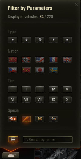
 Significantly optimized, the new Garage filters will get you to your desired selection a lot faster. Working off your requests, we:
- Revised the order of filter options. Now you can choose from vehicle types to nations, then tiers. Additional filtering options are last on the list
- Added a new counter in the filter popover showing the number of filtered vehicles
- Reworked “Additional” block into a filter. Just like with other filters, rented and special event vehicles are now switched on by default
The confusing “Reset Filters” button (often mixed up with “Apply Filters”) will soon be replaced with a far more useful search bar. Here, you can search by name, taking into consideration all the filters marked earlier, e.g., if you select, heavy USSR tanks, it’ll search among them. If you’d like to search among absolutely all vehicles, don’t apply any filters. Just type the name to get a full list of all available vehicles whose name(s) contains the characters you typed in the search field.
Vehicle Carousel
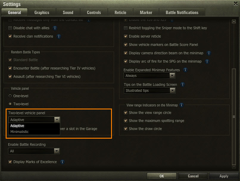
Starting in 9.17.1, you’ll no longer need to go to the Settings menu to switch between one and two-row carousels. You can do it right in the filtering popover: just click the button to the left of the search field (If you don’t mind going the long way, the similar option in the menu remains). However, we urge you to check out the Settings menu regardless. There’s one useful new option in there: minimalistic carousel display. Compared to the adjustable layout you are all familiar with, it keeps small-row design even if you switch to high screen resolution.

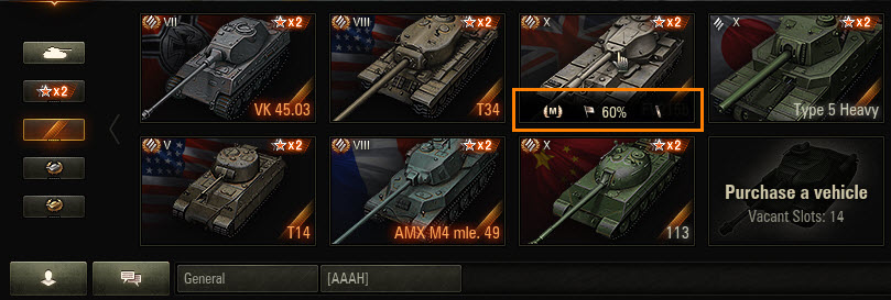
To save you some time when checking additional stats, we implemented a few new information blocks for vehicle slots: Mastery badges, win ratio, and Marks of Excellence. Just hover over the vehicle slot to view them.

Platoons: Spawning and Postmortem Camera
Getting placed far from your fellow Platoon members is a frustrating experience that can seriously undermine your battle plan. It takes a long time to rendezvous, not to mention the precious seconds that you lose when coordinating this “reunion.” Working off your direct feedback, we’ll put an end to it with an additional logic to prevent Platoon members from getting placed far, far away. Instead of random start positions, vehicles will be placed as close to each other as the map, the number of Platoons in a battle, and the Platoon setup (vehicle types) allow.
Yet another frustrating scenario that you brought up to us occurs when playing in a Platoon and your tank gets destroyed. You, most likely, want to see what happens to the people you were fighting with. However, you often have to click through a good half of the team roster before you finally switch to your Platoon mates. And it's often too late when you get to the right one. Starting in 9.17.1, the camera will automatically switch to your first Platoonmate on list. Left clicking will move the camera to the next Platoon member, instead of the next teammate down the list.
Battle and Personal Missions UI
Too much isn't always a good thing, which seems to be the case with missions. Sometimes, it gets hard to keep track of all of them. What we are going to do is improve on the very way they are brought to you in the Garage so that you get timely notifications about completing a mission, rewards you earn, and new tasks you get. Simply put; we’ll ensure you don’t miss on the fun.
As many of you know, to get the first taste of personal and battle missions, you have to level up to tier IV. And Battle Training missions are there to help you climb the ladder. Starting in 9.17.1, you can access them by clicking a special flag in the Garage:
Starting with tier IV, you’ll see two flags: daily and personal missions, each animated to inform you on changes to the number of available missions, rewards, and switching between mission types. Once you complete all daily missions, a check mark on the flag will inform you about it, while hovering over a flag will open an info tip with the full list of missions and rewards for them.
Need a detailed breakdown on a certain mission? Just click the one that excites you most, and it’ll appear on a tooltip including basic and extra conditions, as well as the rewards for fulfilling each group of tasks.
The Battle Missions and Specials screen is in for a revamp, too. To improve navigation, we’ll group all missions into three tabs: all available missions, Specials, and missions for the current vehicle, with ribbons marking new arrivals and the full list of rewards to the selected task at the bottom right.
These improvements are just a small fragment of what we have in store for Battle missions UI, and we’re looking forward to hearing what you think. Your feedback will help us prioritize future work and improve on the overall experience moving forward.
